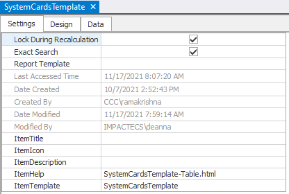
The SystemCardsTemplate object settings are as follows:
NOTE: Before saving the template as a new card object, be sure to update the ItemHelp field! (Currently the field can only be updated in the desktop model.)
Click HERE for further information on the SystemCardsTemplate object settings.
Table Default Settings Fields: These fields apply to ImpactECS Table objects only:
ToolKitAndWebTemplate, Model Download 1.0007 Topic Status: Under Construction as of 12/3/2021, 4:10 PM
ImpactECS Object Default Settings Fields These fields apply to ALL ImpactECS objects:
Additional Model Level Settings Fields: These fields apply to ALL ImpactECS objects:
Design and Data are designed by model builders and/or administrators. |
The SystemCardsTemplate table structure is as follows:
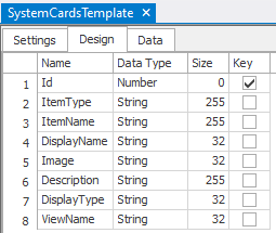
Each column has a function:
1.ID column sets the order of the item within the resulting view of the main browser window.
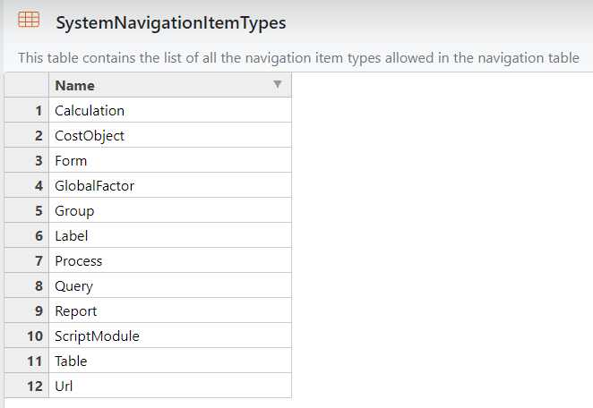
2.ItemType column sets the item type of the object in the ItemName column.
a.This is a drop-down list based on the SystemNavigationItemTypes table
This list is used by two processes:
Navigation Panels (SystemNavigationTemplate)
Card View (SystemCardsTemplate)
ToolKitAndWebTemplate, Model Download 1.0007 Topic Status: Under Construction as of 12/3/2021, 4:10 PM
|
3.ItemName column is the name of the ImpactECS object that will be accessed when the user clicks within resulting menu.
4.DisplayName column contains the text the user will see when viewing the resulting menu.
5.Image column sets the image for each item within the resulting menu.
a.Font Awesome images can be found on this website: https://fontawesome.com/icons?d=gallery&p=2
i.NOTE: to use Premium Font Awesome icons, see Font Awesome Settings
Add the URL provided from Font Awesome to the Font Awesome Kit URL field (located in Model Settings) to link the model to the license. This allows the model to use premium icons. If there is no URL/License available, leave blank and use the free icons found here: Font Awsome Free Icons
NOTE: This field is only available to model administrators.
Example: 
ToolKitAndWebTemplate, Model Download 1.0007 Topic Status: Under Construction as of 12/3/2021, 4:10 PM |
ii.System Images can also be used to upload and reference images.
6.Description column adds a description underneath the ItemName based on ItemType
a."Group" will add the description below the bold text
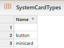
7.DisplayType column allows users to set which object will display: card, button, or minicard.
a.This is a drop-down list based upon the SystemCardTypes table
Available card types are:
1."' designates the main panel will show a card with a title, an image, and a description 2."button" designates the main panel will show a button with a title 3."minicard" designates that the panel will show a mini-button with a title and a description
See the Card Types page in the demo model for examples of each card type.
ToolKitAndWebTemplate, Model Download 1.0007 Topic Status: Under Construction as of 12/3/2021, 4:10 PM
|
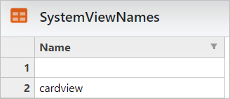
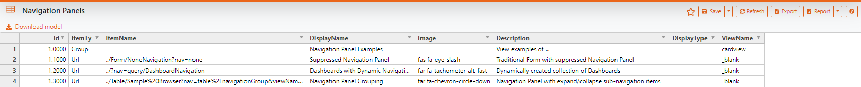
8.ViewName column allows users to set the view of the object in the browser then the item is clicked:
a.This is an editable drop-down list based on the SystemViewNames table
Available view names listed in this table are:
The views set via this field will apply to the object designated in the ItemName column of the SystemNavigationTemplate table, UNLESS the object's settings fields are configured to show a different view.
URL ItemType views are not limited by the drop-down list; URLs can have any string value as a ViewName.
Example of URL ViewName:
NOTE: "_blank" designates that the item will open in a new window. For more available options please refer to this link: https://developer.mozilla.org/en-US/docs/Web/HTML/Element/a
ToolKitAndWebTemplate, Model Download 1.0007 Topic Status: Under Construction as of 12/3/2021, 4:10 PM
|
ToolKitAndWebTemplate, Model Download 1.0007
Topic Status: Under Construction as of 12/3/2021, 4:10 PM